Please see the attachment below for the comment I posted on my classmate’s blog:
Author: ninasandhu (Page 1 of 2)
Please see the link below for the comment I posted on my classmate’s blog:
What AI tools I found useful in my explorations and how did you use them
Throughout this course, we have been tasked to create various lessons of our own implicating different learning techniques such as; Mayer’s learning principles, multi-media learning principles, and acessibilty principles. Therefore, when exploring AI this week I wanted to see how it could be used to create a lesson plan, incorporating the concepts we have learned so far. When browsing through the different AI tools we were given to explore I decided to use ChatGPT and Stable Diffusion. I have had little experience myself using AI tools. With the recent rise in the popularity of AI tools, I have heard a lot about ChatGPT from my friends and on the media. So, in the module, I decided to take the opportunity to explore ChatGTP for myself. I aimed to explore how it could be used to design an accessible and effective lesson, applying the principles we have learned throughout this course. Additionally, I wanted to incorporate imagery into my lesson. Therefore, I chose to use Stable Diffusion to create a piece of artwork to go along with the lesson plan.
Please see the screenshot below for the lesson plan ChatGTP designed for me, as well as, the image Stable Diffusion came up with. The topic I chose was bike safety for 3rd-grade students. My elementary school had a bike day where they taught bike skills and safety. I wanted to mirror this concept in my lesson as spring is in motion, and kids are going to be playing outside much more. For some, it might be their first time riding their bike, so learning to do it safely is a lifelong skill I am sure they will appreciate.
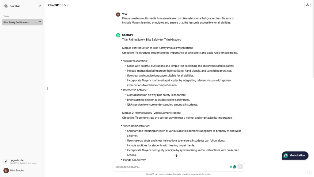
“Please create a multi-media 4-module lesson on bike safety for a 3rd-grade class. Be sure to include Mayers learning principles and ensure that the lesson is accessible for all abilities.” prompt. ChatGPT, 13 Feb. version, OpenAI, 27 Mar. 2024, chat.openai.com/chat.

“Accessible drawing of a kid drawing a bike.” prompt, Stable Diffusion, OpenAI, 27 Mar. 2024, stablediffusionweb.com/.
How accurate or successful were the learning objects you created using the AI tools?
I directed ChatGTP to create a multi-media 4-module lesson on bike safety for a 3rd-grade class, applying Mayer’s learning and accessibility principles. I think that ChatGTP did an excellent job of creating a lesson plan. I was amazed by how swiftly and easily it came up with a comprehensive lesson, with a 2 sentence prompt. I was impressed with how it laid out each module point-by-point with an objective, instructor demonstration/presentation, and learning activity. I also think it did a good job of applying different multi-media principles specific to each module. For example, module 2 utilized a video presentation, whereas, module 4 used an interactive game. Furthermore, ChatGPT did a good job of applying Mayers learning principles too. ChatGPT suggested using contiguity by matching visual text with instructor demonstration. Lastly, it touched on accessibility well by including accommodations to make things accessible for a wide variety of students. As seen in module 2 where ChatGTP suggested the video demonstration should include audio sound and subtitles.
Overall, I was very impressed with the lesson that ChatGTP created. In the past, I have heard from peers that ChatGTP can often make mistakes. To prevent this from occurring in the development of my lesson, I chose a prompt that was very specific and simple. It can be very tempting and easy to assume that AI tools are always correct. However, we are aware that this is not always the case. One thing to remember while using AI tools is to proofread its work, to ensure all facts are valid and correct.
My experience with Stable Diffusion was great as well! It created a cute little image of a little boy riding a bike- that I think went along perfectly with the theme of my lesson! In previous class projects, I have attempted to look for online images, and first-hand know that it can be difficult to find exactly what I was looking for. I think Stable Diffusion is a great resource as you can task it to create an image you desire, just by typing in a prompt. Moreover, enjoyed how it could generate multiple images for one prompt. That way if you are not happy with the initial image, others are available to ensure you can pick exactly what you like.
What ethical concerns do I have about the use of some of these AI tools?
This being my first AI experience, I think it can be a very useful tool. That being said, it could be a slippery slope if not handled with care. I have heard stories from professors about students using ChatGPT to write entire essays or assignments. After exploring AI in this module I have realized it helpful tool, but, I do understand it is very powerful. I might use it in the future to explain complicated concepts I do not fully understand. It would have been nice in my past biology class to explain dense theories that professors would skim over. However, I am aware of the importance of not pushing ethical boundaries with AI tools and am mindful of the serious plagiarism repressions with the misuse. So all students need to review UVic’s policies around AI use, before exploring its resources.
Moreover, I have learned that AI can often make mistakes. Therefore, there is a high likelihood of the spread of misinformation with its use. Once again, it emphasises the importance of double-checking all information produced by AI- rather than assuming it is true.
Applying SECTIONS to Canva
Students: Canava is available for all students who have access to the internet. Wheater it is a school computer or a personal laptop, Canava can be easily accessed. An email address is necessary to sign up, however, most schools provide one for students so if they do not have their own personal email address, it is not much of a problem. Moreover, Canva is accessible for free. Some features and specialized images do require a paid subscription. However, everything that is needed to make basic infographics or presentations is available for free.
Ease of use: I think Canva is very user-friendly. It has clear headings and labels for its various features, such as templates and text. It is highly reliable, in the sense that it auto-saves drafts of work and can store projects directly on the sites to come back to as you please. Although the site does not require any specific special skills or abilities- it can be very busy and overwhelming for first-time users. So, I think it would be beneficial for users to play around with the site first, getting familiar with all its features before starting their project.
Costs: In terms of monetary costs, Canava is free for all users. Most images and features can be accessed and used without any associated costs. Which is nice for basic users who don’t regularly access the site, or students. However, not everything on the site can be accessed for free. For example, many templates are considered “premium” and require a paid membership for use. Moreover, the timeliness of the platform is very subjective to the user. For instance, if you are choosing to build a basic infographic without altering any template features, this can be done within minutes. However, Canava is highly customizable. So if a user wants to create their template, or highly modify the colours, images, etc. of an existing one this would require much more time and effort.
Teaching functions: I think that Canva is a great teaching tool. As it gives instructors demonstrate lessons utilising various media types. For instance, it allows instructors to create presentations, videos, worksheets, etc. for teaching purposes. Creating a video would require extra equipment such as a microphone and camera. But, standard presentations or infographics could be made directly on the site, without any specialized equipment.
Interaction: Canava is somewhat interactive. It does allow users to manually share their work with those whom they please, via email. And you can create projects with other users. However, there is no one unified dashboard where users can log on and view or edit each other’s profiles/work with ease.
Organisational issues: Most teachers or educational staff have had experience using Canva at some point. I was originally introduced to the site by a psychology professor, as I was tasked to build an infographic using the platform for an assignment. With Canava being such a popular educational site, I found that most people have encountered it at some point. Therefore, if one were to ever have any user issues, I am sure they could ask teaching staff for support. I have utilized YouTube in the past to help me with my quick questions. There are plenty of videos showing explaining common issues users face, and how they can easily be resolved.
Networking: Canva being a site similar to PowerPoint used to create resumes or presentations, lacks networking. Other than the fact that you can share your work with others, it does not allow you to publicly access or view others’ material. That could be a feature that could finally be beneficial in the future. Whenever I make a presentation on there I am always very proud and would like to share it with others. Not only is it good for inspiration as I have seen my friends create amazing things on there, but is a great way to learn by reading peers’ work.
Security and privacy: Canava is a secure site and users are required to set up an account to join with an email and respective password. Users’ privacy is maintained as the public is not permitted to view or access their work, as all accounts are private. Only those whom you chose to manually share work with may access it. With any online site, there is the risk of cyber attacks and information being stolen by hackers. But I have not heard of this being the case with Canava.
What authentic problem would you use to design a lesson using Merrill’s principles?
The authentic problem used to design a lesson using Merrill’s principles was teaching children about bullying. Bullying is very prevalent in school-age children. Unfortunately, most people along with myself have been or known someone who has been bullied. Elementary school is the first time for most that students are socialising and working with a new and wide range of classmates from different backgrounds, cultures and abilities. Therefore, spreading awareness about bullying and how to treat others with kindness is fundamental for social development at a young age.
When designing this lesson, Merrill’s principle that I thought would be helpful to use is activation. Sadly, most children have experienced some form of bullying or discrimination. Therefore, to set the sense of this important and very serious topic students could be asked to anonymously write about things that come to mind when they hear the word bullying. This allows students to share a personal experience (if they feel comfortable) or general thoughts about the topic in a stress-free nameless fashion. Growing up and even now, I consider myself very introverted and shy. My teachers used to use this method to get students to share their opinions on serious or embarrassing topics. I always thought it was helpful because in most cases I would not have responded to their questions in front of the entire class. So I thought it would be a good method to incorporate in my lesson as well.
Another Merrill’s principle that would be helpful to use is solving real-world problems. Using real-world problems can help students critically think about the knowledge they have gained, and apply it to the task at hand. Not only does it allow students to practice the new information, but it allows them to receive critiques on how they could have handled things in an alternative fashion. For instance, in the lesson I designed students could be given a short text or video scenario about a case of bullying. Afterwards, they could be directed to break off into small groups and collectively brainstorm ideas on how to handle the case. This gives them a chance to work collaboratively with others and share how each classmate would have handled things a little differently. I always really enjoyed group work. Sometimes I have a very rigid and black-and-white form of problem solving and thinking. So, getting the opportunity to hear from my classmates and peers always opens my eyes to a different way of thinking and perspective on ideas.
My Lesson Plan
My Experience with H5P
I had a great experience using H5P for the first time. One thing I enjoyed was the variety of activities it had. From drag and drop to image hotspots, it allowed me as the teacher to be very creative and tailor an activity exactly how I thought would be beneficial for the student. Moreover, the platform was also super user-friendly. Each activity type included a written and video help tutorial to guide the user if they got stuck at any point.
Please see the drag-and-drop tutorial I created to help children identify different bullying scenarios. Let me know what you think!
How I found the balance of passive and active learning in this course. And, how it compares to my experience in other courses?
I have had a great experience with the class and the different passive and active learning activities it includes. I enjoy the variety of materials we get to explore. For example, each module consists of a variety of readings, videos, blog posts, and media we get to try. I think this is nice because I find it keeps me engaged while learning. And if I ever get bored or and not in the mood for one type of learning source I can switch to another.
Coming from a science background, I found that my lectures especially were more passive learning- consisting mainly of readings and listening to the professor speak. It would have been nice for the teachers to incorporate active learning techniques into these classes. Such as group discussions, to help actively engage with the material. This would have aided with my understanding of the content, and I could have applied the theory and skills in question. Rather than just memorise and regurgitate the content.
Please see the link below for my video!
The purpose of my learning video
My video aimed to teach an aspect of road safety by demonstrating the hand signals that can be used if a vehicle’s turn signals are not in service.
On the road drivers, pedestrians, and cyclists heavily rely on turn signals to indicate the direction vehicles are heading. However, turn signals can break or go out unexpectedly. As a driver, this can be very stressful because not being able to indicate your direction of movement can easily result in a collision. Therefore, my video showed the proper hand signals that can be used instead of turn signals are crucial to ensure road safety for all!
Why a video was a good choice for my demonstration
Rather than describing using text how to bend one’s arm, being able to physically see the motions can help demonstrate how the signals are performed. This ensures that the hand signals are used accurately and correctly by the viewer.
Moreover, a video was a good choice from my tutorial as the viewer can see the hand signals in use in their real-life setting. I am a visual learner, therefore, being able to see the hand signals physically via video in the setting they will be used in real life (ie. a vehicle) can help them stick in my head. Thus, if I ever need to use them in the future I can visualize how they were performed by putting myself in the shoes of the presenter based on the video’s teachings.
Additionally, a video demonstration is much more accessible than just explaining how to use the hand signal via text or image description. Recording a video allowed me to include audio, video, and text features in my demonisation. For instance, I was able to verbally describe the movements, physically move my arm, and include text descriptions. Including multiple formats of teaching can accommodate the viewer’s learning abilities- such as dyslexia, or hearing issues.
Learning Princinciples Used
Mayer’s learning principles I used while making my video redundancy, contiguity, and coherency.
I practised redundancy by repeating each hand signal demonstration twice in a row. I did this because I imagined the viewer would be following along and performing the actions while watching the video. Performing each hand signal twice in a row prevents the viewer from having to rewind the video in case they missed the previous action. I always find this helpful when personally viewing videos, because trying to find the precise location of the part I missed can be frustrating and time-consuming. Moreover, I chose to show each hand signal twice in a row, rather than, twice randomly throughout the video to help engage the viewers’ minds and bodies. For instance, when I am watching workout tutorials- I prefer to listen to the instructor act out and describe the action first, and then try it out myself. So I thought this would be helpful for others too! For example, demonstrating the right-hand signal the first time allows the viewer to process in their head the motion and the purpose of the movement. And seeing it a second time right after gives them a chance to try the action out for themselves. This allows for a stronger mind-body connection between the action- resulting in the viewer being more likely to remember the motions. As they can process what each motion means and how it’s done linearly.
Next, I practised contiguity by placing the text on my screen directly underneath each hand signal. I included this principle because I thought it would be helpful for people with accessibility issues, for instance, those hard of hearing. If a viewer is unable to listen to my audio their eyes are cued on the screen where to direct their attention (ie. my arm) by the text.
Lastly, I incorporated coherency in my video keeping my video to one topic and text on screen minimal. I did this because I thought it would be important to keep the video concise- to prevent cognitive load on the viewer. Since my topic itself was simple I tried to avoid making my video longer than necessary by rambling or adding unnecessary edits. I find if a video goes off topic I can zone out and become disengaged. So I kept the video short and simple to ensure the viewer would be attentive the entire duration of the lesson. Additionally, I tried to keep the text on the screen to a minimum. I thought this would help those with trouble reading as they can understand the purpose of my actions in just a few words, rather than big chunks or text.
Challenges I faced while making my video
This was my first time filming and editing a video that being said I ran into lots of unexpected roadblocks and challenges. For instance, I was shooting my video outside and on my older iPhone I found the speaker picked up a lot of background noise. This resulted in me having to do a voiceover for the majority of my video rather than speaking directly to the speaker in real time. That being said I had to shoot my video multiple times as I found that my clips were too short for my audio script. I found this a bit frustrating as it took me much longer than expected to shoot the video, and having to continually go back and do this step was tedious. I also struggled with meditating on my video. More specially, I found it difficult to make smooth and clear visual transitions between scenes. At times, I thought my video was a bit choppy. However, since this was my first time exploring the video-making and editing process I think I did pretty well.
What I found the easiest during my video-making process
I found that applying Mayer’s learning principles to my lesson and making the video script came easily to me. Being a student I have watched many videos and tutorials teaching various concepts. Therefore, I think I have a good understanding of what makes a good and poor instructional video. Earlier exposure to Mayer’s learning principles in previous modules has stuck with me and I feel capable of readily applying the concepts I think are necessary and helpful to portray an effective lesson. Also, having done many in-class presentations before so- I have had lots of experience making and memorising scripts. After I decided on the topic of my video I found I was easily able to draw up a script to bring my ideas to life.
How I would approach things differently next time
Making the video I found it challenging to edit smooth transitions and include real-time audio. Next time I go about things I will focus more on my editing by working on including smooth transitions between scenes. I think this will help aid my visual signalling. Providing seamless transitions between scenes allowed me to visually cue the viewer I was moving on to the next topic. Therefore, those in a loud environment would understand the flow of my thoughts just by watching the visual component of my video. Rather than being distracted by awkward cuts mid-scene. Also, next time I will try and utilise additional filming equipment to help aid with my audio. This being my first time filming a video I was not comfortable utilizing special equipment. I think next time I will try using a wind block to prevent the camera speaker from picking up additional background noise- so I can include more real-time audio instead of a voiceover. I felt very intimidated and overwhelmed initially starting this project. This was because video making and editing is a new experience for me. Therefore, I was not comfortable in my abilities to execute a good final product. I don’t think my video itself was perfect- which was expected. But, I think I was able to effectively work with the equipment and resources I had to produce an effective lesson. I feel confident in the future that I can fact make a good video, and I am excited to work on some of the challenges I faced the first time around.
My simple script
My Storyboard
Please see the link below for the comment I made on my classmates’ work this week:
In this module, we examined various storytellers and their techniques to portray a meaningful story effectively. Additionally, we explored the Twine platform and how it can be used to create our branched narratives. Please see my blog post below to see how things went!
The TED Talk presenters from, “7 Storytelling Techniques Used by the Most Inspiring” I found most compelling.
I was extremely impressed by all the presenters in the “7 Storytelling Techniques Used by the Most Inspiring” video we got a chance to watch this week. Each individual was extremely composed and portrayed their stories in a captivating manner. The speaker whom I found most compelling was Malcolm Gladwell and his talk on “Choice, happiness and spaghetti sauce”. The reason I thought this was because of how he brought to life the story of his friend Howard. Despite Howard not being in the room nor a picture of him show- based on how Malcolm described this character I truly felt as though I knew and could picture Howard and all his quirks. Additionally, Malcolm spoke so highly of his friend and with such great admiration. This made me care about his story and the impact he made in his career. So much so that I researched Howard more on my own time! This was because I grew to like him as a person from how Malcolm brought to life his personality. Additionally, I enjoyed Maclom’s comedic tone he had throughout the entire presentation. For example, including little sayings and jokes Howard himself would use made learning about an inherently boring topic of spaghetti sauce an exciting experience!
The storytelling technique I recognized during the Ted Talk
A technique that I felt Malcolm did a great job with was “immersing the audience in the story”. Despite not showing many images or videos during his presentation I think Malcolm did a great job of doing this verbally. Throughout the presentation, he introduced elements in thorough detail and description. This helped activate my senses, especially when he spoke out about the food. I felt as though I could taste the sweetness in the Pepsi he was describing or, even see the chunkiness in the pasta sauce he touched on. The use of this technique as a listener helped me to feel engaged and not lose interest throughout the entire duration of his 18-minute-long presentation. This intense high level of description is something I will try to use in the future. I find that sometimes my writing can be a bit boring and dry. So applying for description, and thoroughly explaining things it will help keep the reading tuned in. Moreover, he touched on generic items most people have encountered before, such as mustard and coffee. My first-hand experience with the products as a consumer aided me in plunging into the story world he had established.
Branched narratives through Twine
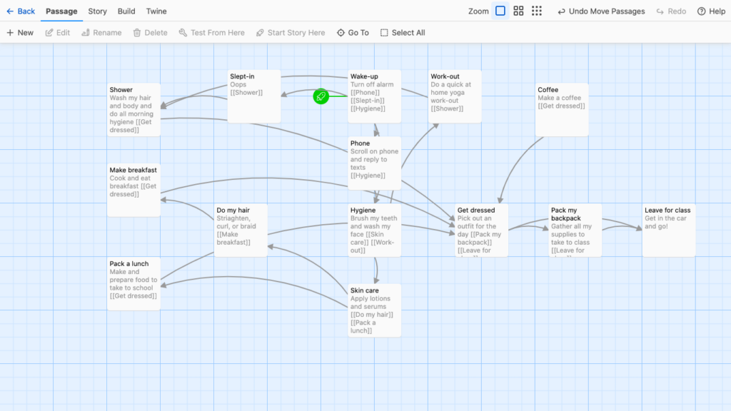
Please see the attachment below for the branched narrative I created using Twine! The topic I chose to showcase was a morning get-ready with me for school. I decided to explore this topic because I love watching these kinds of videos on YouTube and TikTok as I find them calming and interesting.
This was my first time creating my own branched narrative and using Twine. That being said, Twine allowed me as a learner to design my story in a user-friendly interactive manner. Brached narratives like Twine allow learners to view all elements of the story collectively as a whole and a whole as well as, an individual entity. By being able to view all the parts of a story together on one grid I could see what parts were missing and how each piece led to another. Next, branched narratives utilize arrows to connect ideas. This helped me link my thoughts, and it provided a guide to see how each step flows from one to the next. Also, the arrows allowed me to think less linearly about my story-building process. Having the ability to branch off at any point enouged me to explore different routes my story can take at each step of the way. Another point I liked about Twine allows you to make notes in each element. Even so much as including one-word headers, helped me to organise my ideas and explain my thought process throughout the entire experience. I found this helpful, as I could leave and come back at any point during my creating process and know exactly what I was thinking previously.
Other uses of branched narratives
I have seen the use of branched natives as early as a child, in story books where you can jump from chapter to chapter to customize your reading experience and storybook ending. More recently as an adult, I have seen branched narratives in t.v. show, such as “Black Mirror”. Producers made a series of episodes in which each viewer got a different sequence to watch the show. Thus, depending on which order one received each person had a different ending. I think branched narratives are a great use of media! They add excitement to the traditional schema of storytelling, by giving “power” to the audience to choose their outcome. Rather than experiencing the direct narrative path the author had concretely laid out for you. Also, I think that branched narratives are very socially engaging. I remember how much excitement and discourse both the stories in elementary school and t.v. series as a young adult created when first came out. People were eager to share their unique experiences and hear about what others thought of processes and endings. Please leave a comment, as I am curious to hear about your experience with branched narratives!
Please see the link below for comments I made on my classmates’ work this week:
This week we investigated different platforms and extensions such as Canva and text-to-speech readers to explore how design principles can be utilized to make effective and successful media sources. Please see my blog post below to see my thoughts and opinions on how things went!
WAVE accessibility report
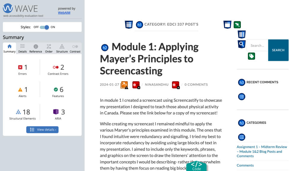
When I ran my first blog post from Module 1 into the WAVE accessibility report, I was surprised to see that I did not have more errors. Considering that this was one of my first blog posts, and, I was not aware of the different accessibility principles in this unit- I was expecting to see more errors than I did. Based on my report, one thing I will do differently moving forward is to be aware of the contrast. I will make sure my text can effectively stand out from the background colour, to ensure those with visual impairments do not have any difficulties reading the material.
Text-to-Speech Tools
I used both Read Aloud and TSSReader Chrome extensions to read out load my blog post. This was my first time using a text-to-speech tool, and I was surprised to see how well it translated my writing. In the past my courses have used close captions to translate their speech into text, so students can view when watching the recorded lecture. With those, I found the cations would have a lot of mistakes, especially with the specialised jargon the teacher would use in my biology courses. Despite translating all the text effectively in my blog post- I found that the tone of the speaker was very dry and non-expressive. Thus, making it quite boring to listen to. I tried using different voices and accents to hear the material as well, such as Irish and Australian speakers. However, I found that these made it more difficult to understand the text- causing me to listen more intently to understand the content.
Canva Infographic
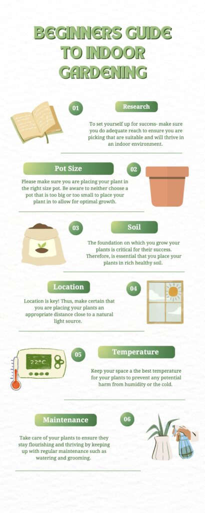
Please see the image above for the infographic I made on tips to start an indoor garden. I chose this topic as it is something I am interested in starting myself. Also, I know that most university students are living in either on-campus housing or basement suites. Therefore, they may not have access to an outdoor yard for gardening. So, I imagined starting indoor gardening would be more prevalent and accessible to most!
When creating my infographic the design principles I focused on were proximity and hierarchy. I made sure the images, numbers, and text for each point were close to one another- so the reader could easily associate the grouped information together. Additionally, I practised hierarchy by assigning each step a number to emphasize numeral importance. I love it when teachers number headings and subheadings, I find it so helpful when studying. So I knew this was something I wanted to include. Furthermore, I made sure the font size of the text heading was the largest- to draw the readers’ attention to the keywords. I found that applying these principles made it much easier for a reader to create flow when viewing my infographic and draw my attention to the key bits of information.
The elements I incorporated from good infographic design were limiting my colour palette and keeping my imagery simple. When designing my infographic I tried to keep the colours all with a neural theme, so everything would appear cohesive and well put together. Through my time at university, I have grown to appreciate simplicity in lecture slides- especially with content-heavy courses. I think it helps me focus on the content of the slides, rather than getting overwhelmed by excessive colours and images. So I found this principle very intuitive. Also, I tried to keep imagery simple by sticking to a “clipart” theme and ensuring the images were not too overwhelming by sticking to one main image per graphic. I found that applying these principles made my work easy to view and digest the material. As my attention was not being drawn to secondary sources not relevant to the topic at hand.
Another principle I considered came from the “Death by Powerpoint” video from David Phillips was sticking to the 6 main points of discussion. I thought this theory was super interesting. I never knew that the sweet spot for information retention was 6 points per page. After exploring the topic more myself and playing around with adding more/fewer objects per page- I did find that 6 was the perfect number for my brain to handle. I will be using this again in the future with other presentations!
A few things I found that the Canva templates made it difficult to do were utilizing blank space and sticking to 2 fonts. I found that a lot of the templates were very design-heavy and busy-looking. So, I found myself deleting images and simplifying the style choice to help tone things down for the reader.
What inclusive design means to me!
When I think of inclusive design I think of including imagery and graphics that encompass people’s unique cultures, abilities, genders, etc. So everyone has the opportunity to be represented in what they are learning. Being a woman of colour, I always find it more helpful to relate the information to their own experiences, when I feel represented in their work- by seeing people that look like me. So, I would imagine this would apply to others as well! Moreover, inclusive design should also focus on the functionality of the product. For example, ensuring that plain and easy-to-read text is available to accommodate those with reading/visual impairments. Please leave a comment below, on what inclusive design means to you- I am curious to hear!
Please see the links for the comments I made on my classmates’ post this week:
Recent Comments