This week we investigated different platforms and extensions such as Canva and text-to-speech readers to explore how design principles can be utilized to make effective and successful media sources. Please see my blog post below to see my thoughts and opinions on how things went!
WAVE accessibility report
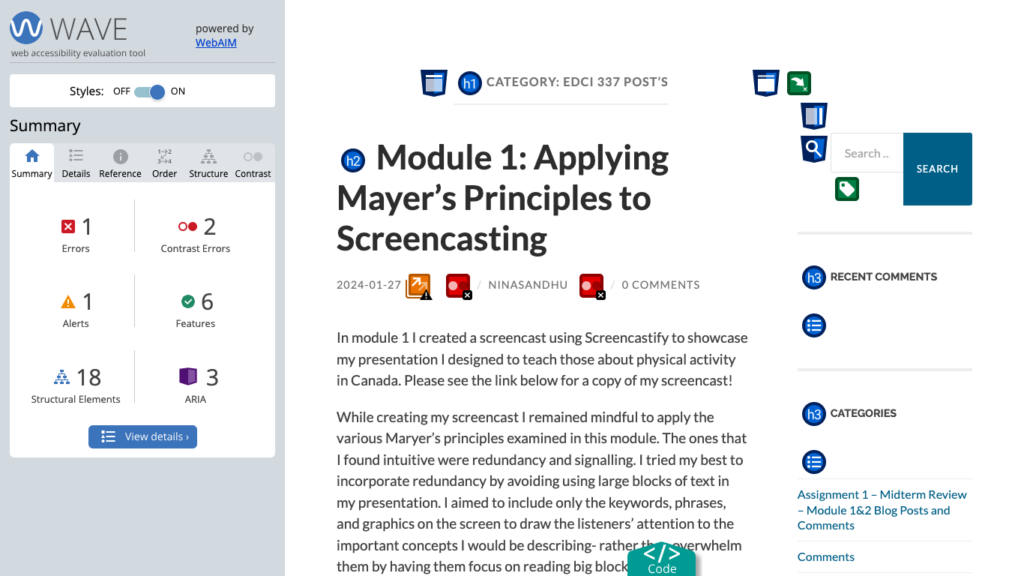
When I ran my first blog post from Module 1 into the WAVE accessibility report, I was surprised to see that I did not have more errors. Considering that this was one of my first blog posts, and, I was not aware of the different accessibility principles in this unit- I was expecting to see more errors than I did. Based on my report, one thing I will do differently moving forward is to be aware of the contrast. I will make sure my text can effectively stand out from the background colour, to ensure those with visual impairments do not have any difficulties reading the material.
Text-to-Speech Tools
I used both Read Aloud and TSSReader Chrome extensions to read out load my blog post. This was my first time using a text-to-speech tool, and I was surprised to see how well it translated my writing. In the past my courses have used close captions to translate their speech into text, so students can view when watching the recorded lecture. With those, I found the cations would have a lot of mistakes, especially with the specialised jargon the teacher would use in my biology courses. Despite translating all the text effectively in my blog post- I found that the tone of the speaker was very dry and non-expressive. Thus, making it quite boring to listen to. I tried using different voices and accents to hear the material as well, such as Irish and Australian speakers. However, I found that these made it more difficult to understand the text- causing me to listen more intently to understand the content.
Canva Infographic
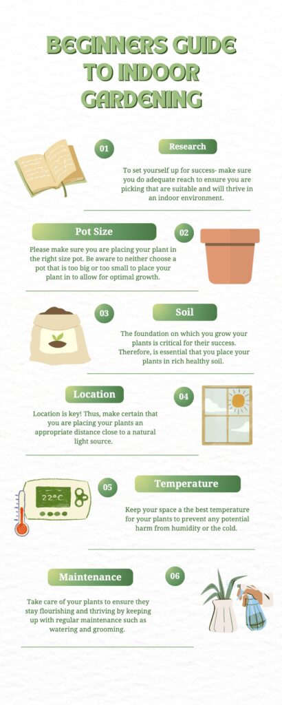
Please see the image above for the infographic I made on tips to start an indoor garden. I chose this topic as it is something I am interested in starting myself. Also, I know that most university students are living in either on-campus housing or basement suites. Therefore, they may not have access to an outdoor yard for gardening. So, I imagined starting indoor gardening would be more prevalent and accessible to most!
When creating my infographic the design principles I focused on were proximity and hierarchy. I made sure the images, numbers, and text for each point were close to one another- so the reader could easily associate the grouped information together. Additionally, I practised hierarchy by assigning each step a number to emphasize numeral importance. I love it when teachers number headings and subheadings, I find it so helpful when studying. So I knew this was something I wanted to include. Furthermore, I made sure the font size of the text heading was the largest- to draw the readers’ attention to the keywords. I found that applying these principles made it much easier for a reader to create flow when viewing my infographic and draw my attention to the key bits of information.
The elements I incorporated from good infographic design were limiting my colour palette and keeping my imagery simple. When designing my infographic I tried to keep the colours all with a neural theme, so everything would appear cohesive and well put together. Through my time at university, I have grown to appreciate simplicity in lecture slides- especially with content-heavy courses. I think it helps me focus on the content of the slides, rather than getting overwhelmed by excessive colours and images. So I found this principle very intuitive. Also, I tried to keep imagery simple by sticking to a “clipart” theme and ensuring the images were not too overwhelming by sticking to one main image per graphic. I found that applying these principles made my work easy to view and digest the material. As my attention was not being drawn to secondary sources not relevant to the topic at hand.
Another principle I considered came from the “Death by Powerpoint” video from David Phillips was sticking to the 6 main points of discussion. I thought this theory was super interesting. I never knew that the sweet spot for information retention was 6 points per page. After exploring the topic more myself and playing around with adding more/fewer objects per page- I did find that 6 was the perfect number for my brain to handle. I will be using this again in the future with other presentations!
A few things I found that the Canva templates made it difficult to do were utilizing blank space and sticking to 2 fonts. I found that a lot of the templates were very design-heavy and busy-looking. So, I found myself deleting images and simplifying the style choice to help tone things down for the reader.
What inclusive design means to me!
When I think of inclusive design I think of including imagery and graphics that encompass people’s unique cultures, abilities, genders, etc. So everyone has the opportunity to be represented in what they are learning. Being a woman of colour, I always find it more helpful to relate the information to their own experiences, when I feel represented in their work- by seeing people that look like me. So, I would imagine this would apply to others as well! Moreover, inclusive design should also focus on the functionality of the product. For example, ensuring that plain and easy-to-read text is available to accommodate those with reading/visual impairments. Please leave a comment below, on what inclusive design means to you- I am curious to hear!
Hi Nina, I really enjoyed the infographic that you made, as someone who struggles to keep plants alive I enjoyed the step by step process of what it takes to take care of plants and the clarity of the steps. I have also experienced the same issues that you have with text to speech on teachers lectures not working correctly and not picking up certain words, this is really frustrating and I hope that one day those issues can be fixed and that the Text to Speech gets better. Thanks for the great post!